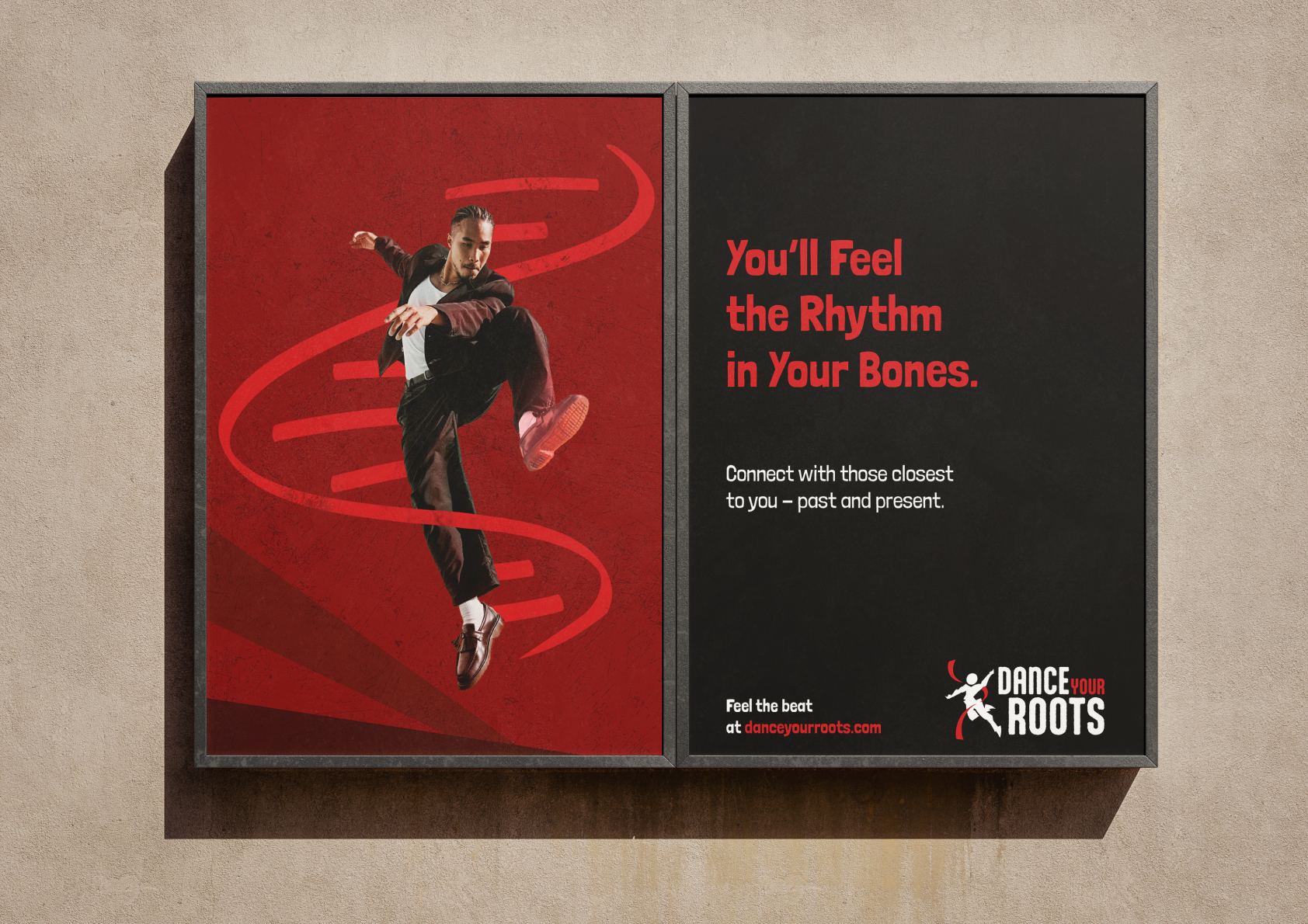
This focused on conceptualizing and branding a dance studio that focused on a variety of cultures. With that in mind, taking an educational approach and marketing towards kids and adults both seemed like the logical step.

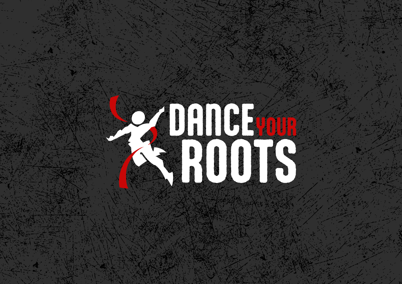
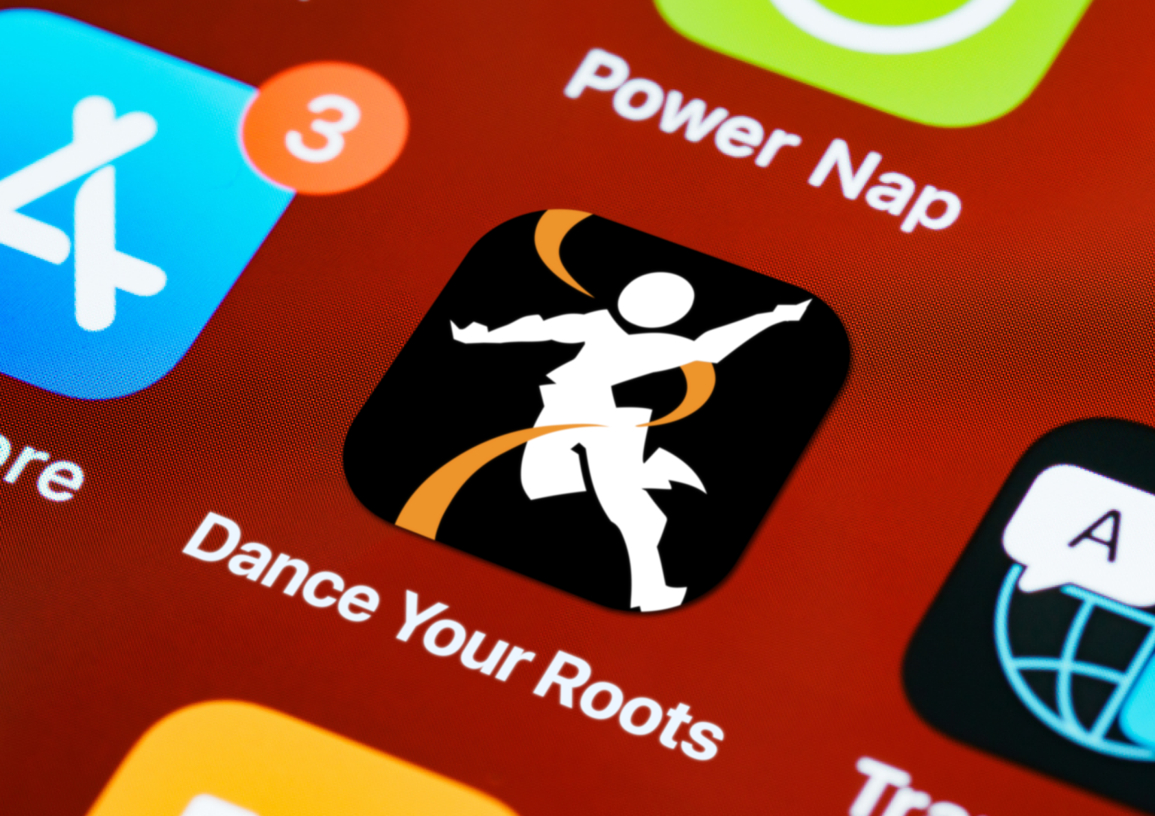
The logo incorporates a dancer with a ribbon, as well as a hidden DNA helix shape - symbolizing the roots that the dancer is learning about.
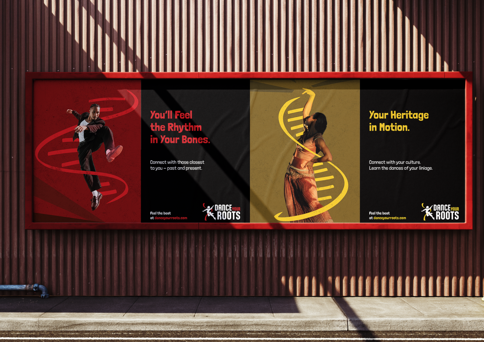
The DNA nature of the helix becomes more apparent in the larger promo art.
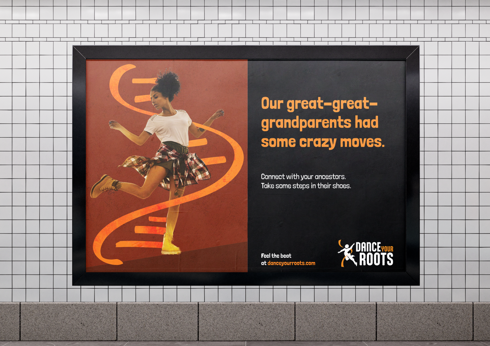


We want to appeal to both parents and their children. The parents in the sense that this is a place they could send children to over the summer, the kids in the sense that it isn't lame - despite the parental approval.