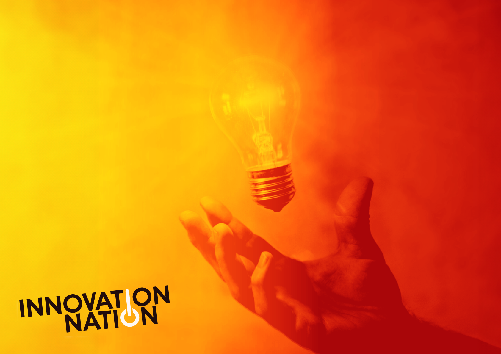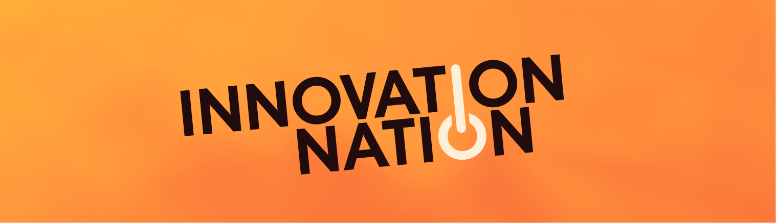
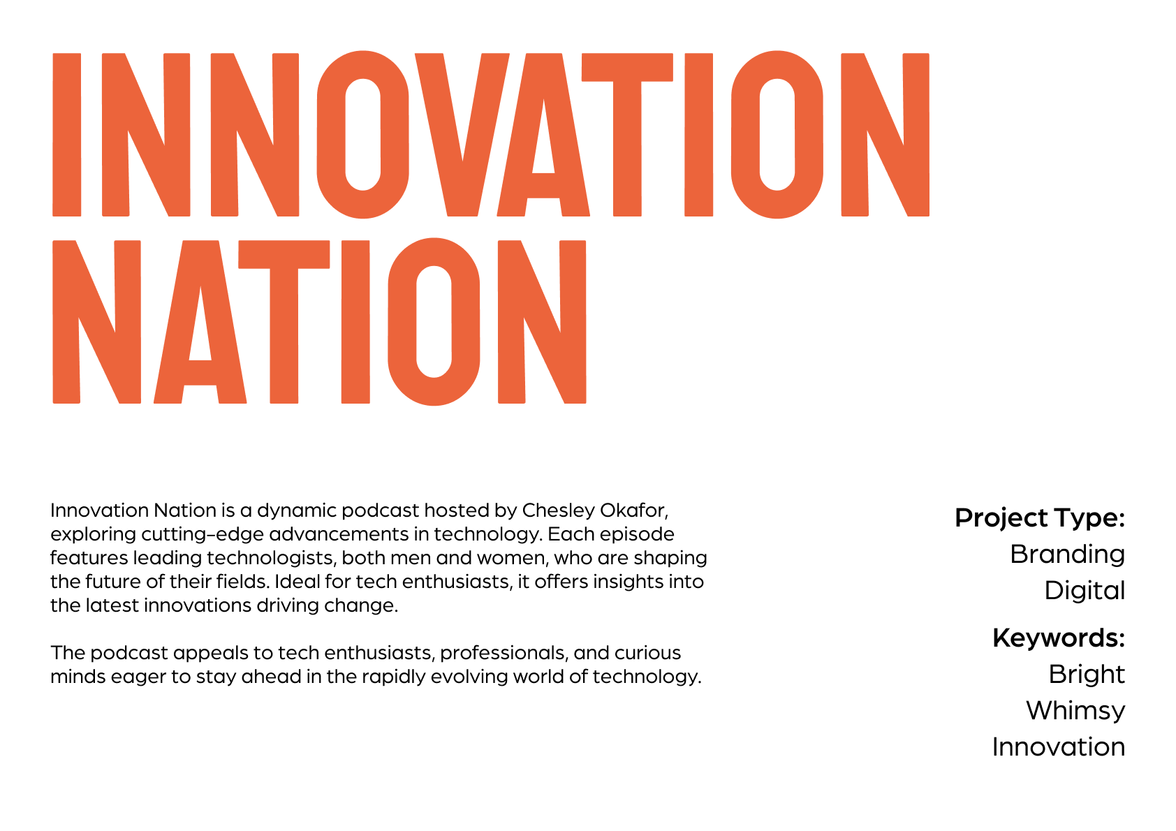
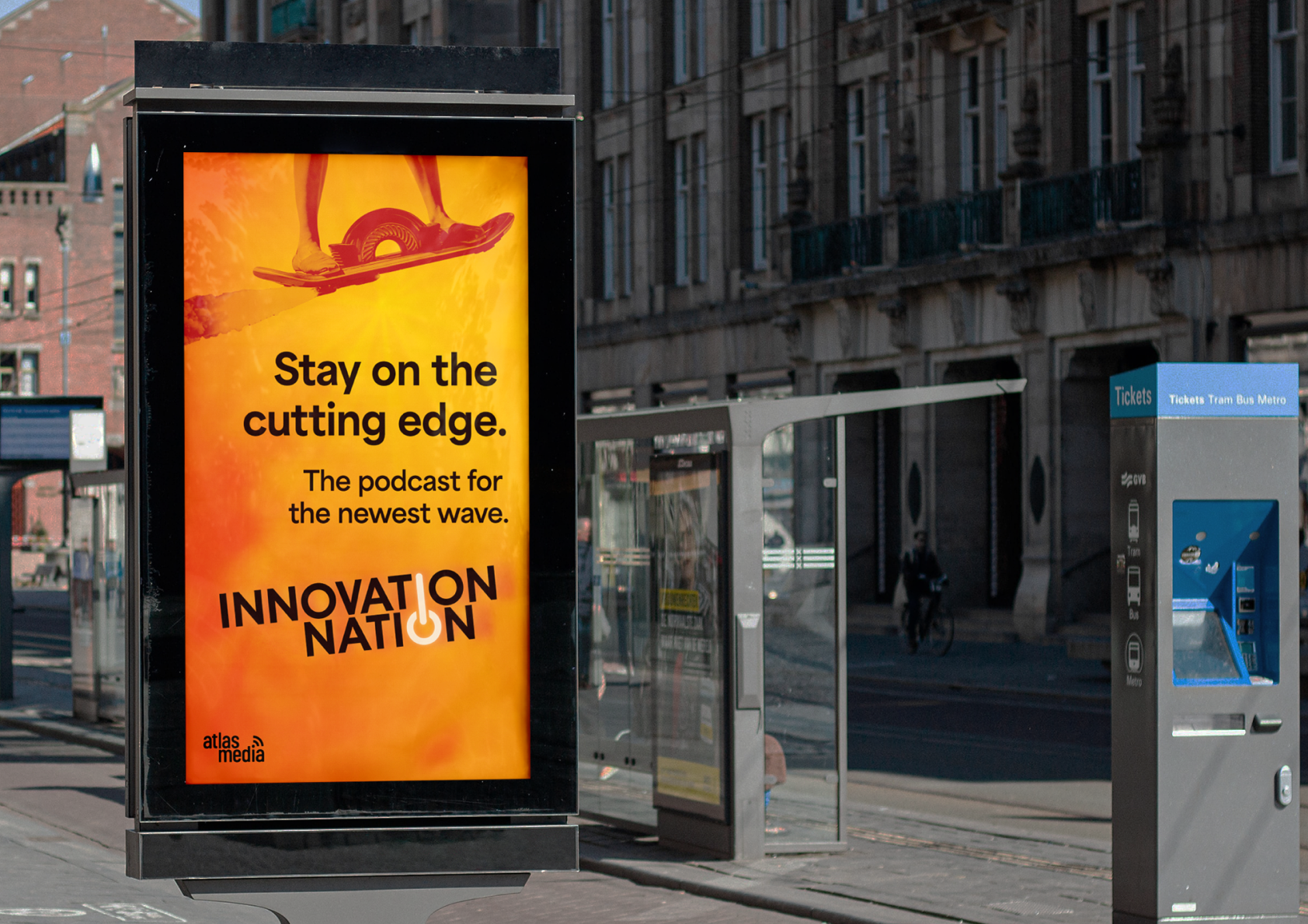
Brand concept for a tech podcast - It would talk about the newest, most fantastical and sci-fi advancements in technology, and discuss them and their implications with people involved in those fields — generally in a celebratory way.
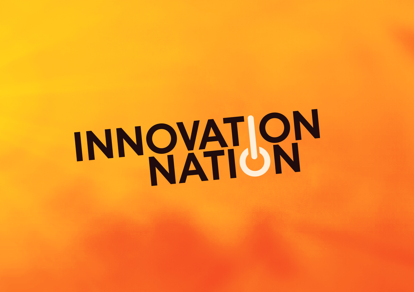
I wanted to keep that technical aspect in the logo, hence the power button made from the I and O. But I wanted to capture that energy, that fevor of advancement and progress - hence the very fiery color screen. Like a computer overheating because it's just so excited.


The bright color scheme helps it stand out amongst a sea of podcast icons.
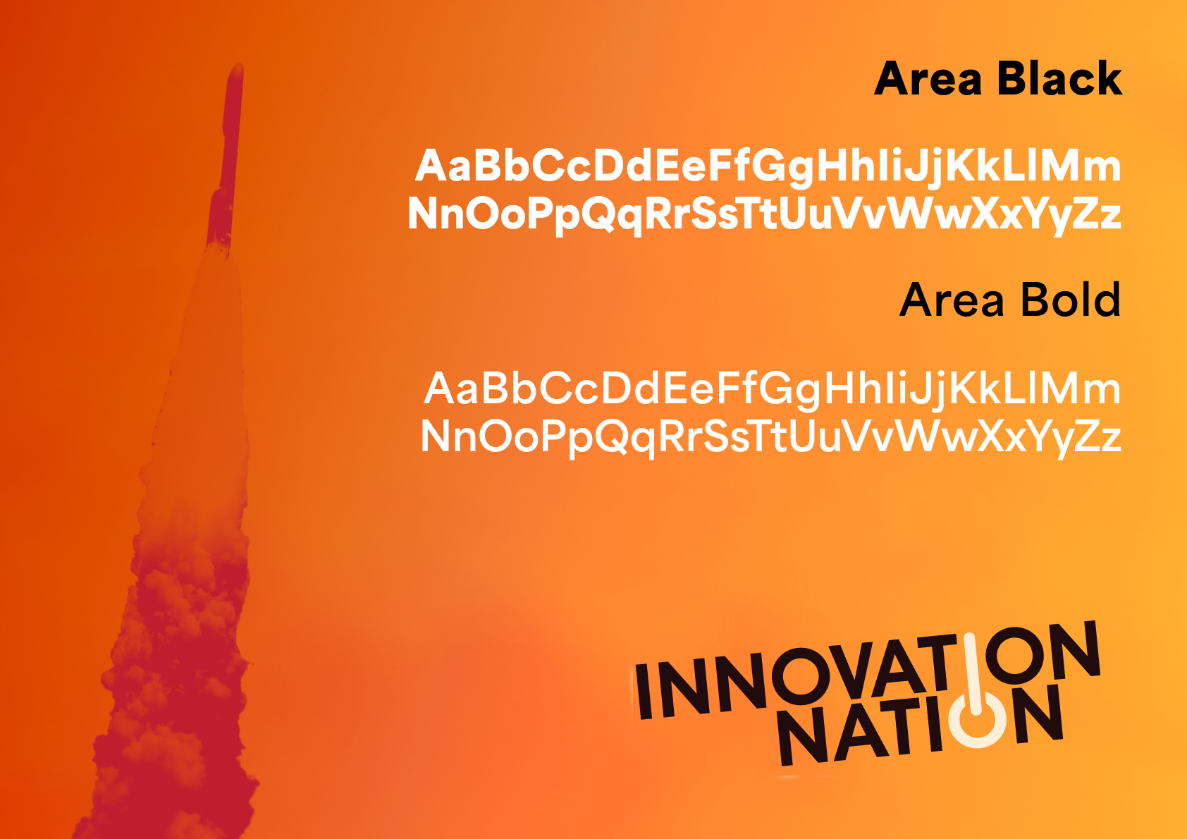
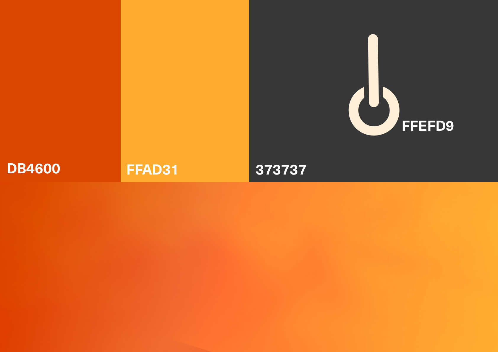
The main color scheme is already very visually aggressive - so I didn't want to go beyond what we already had regarding color scheme and fonts.


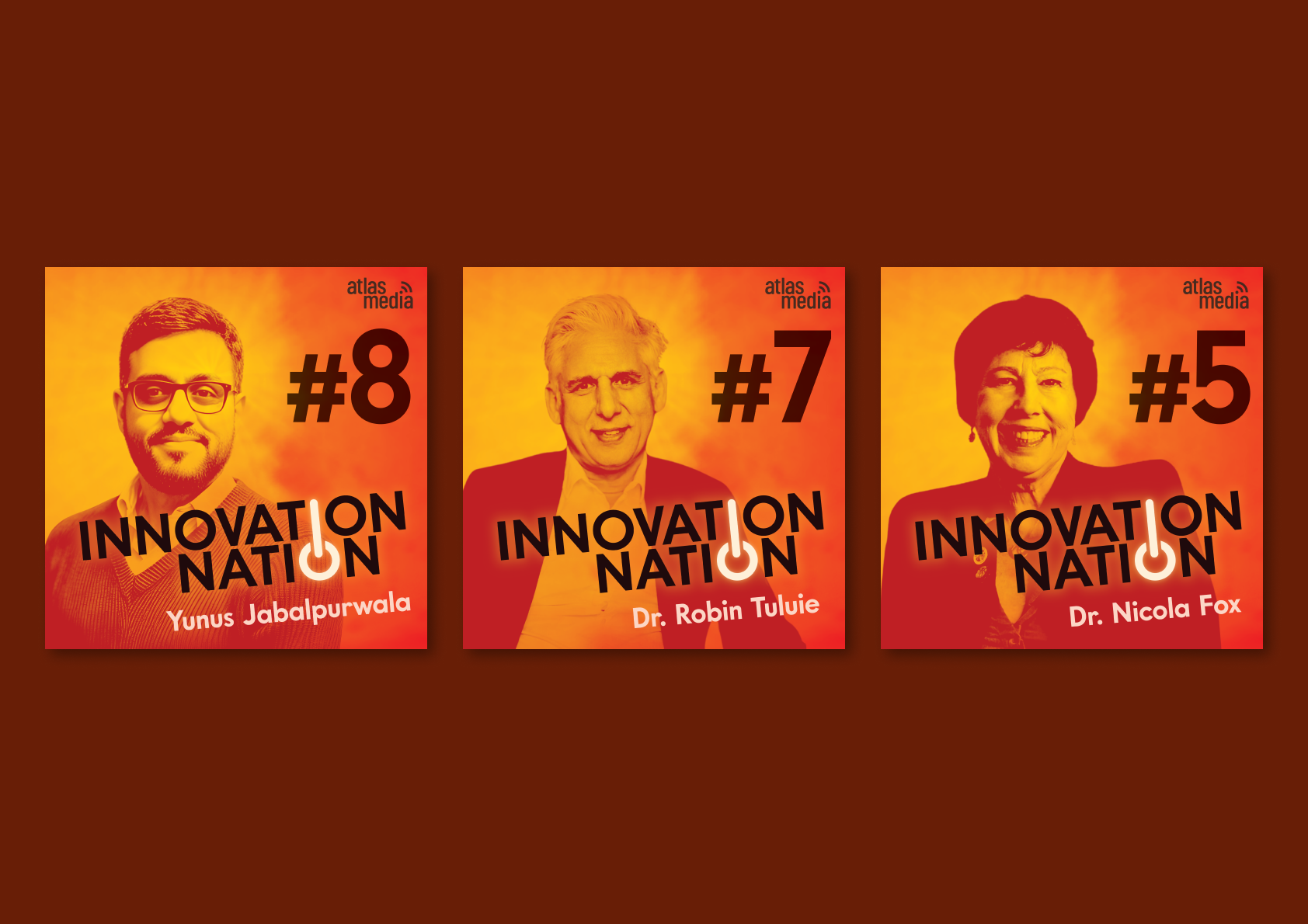
Episodes would have variant covers - based on whichever guest was featured that week.