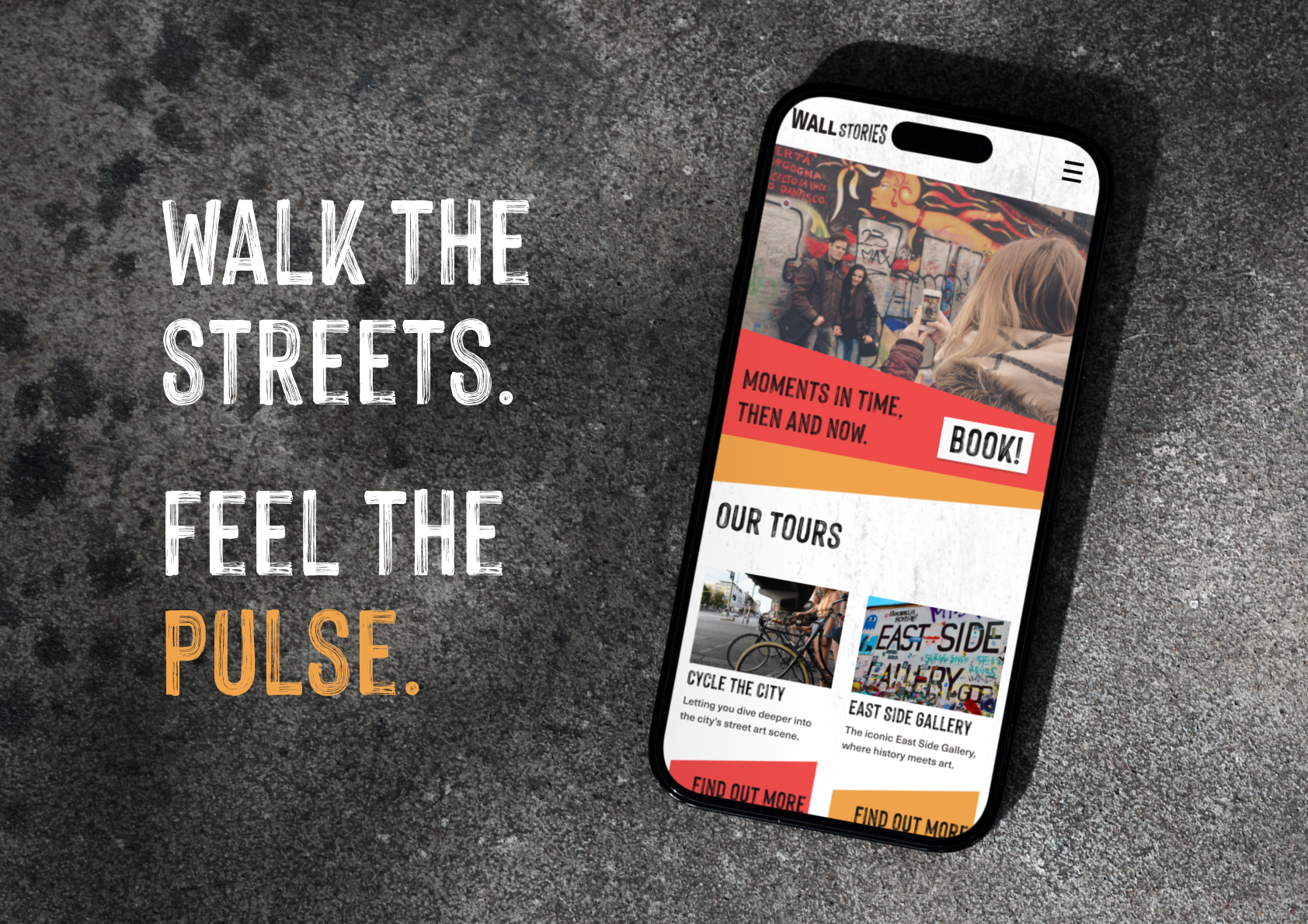
A brand project based around promotion for a street tour company based out of Berlin.
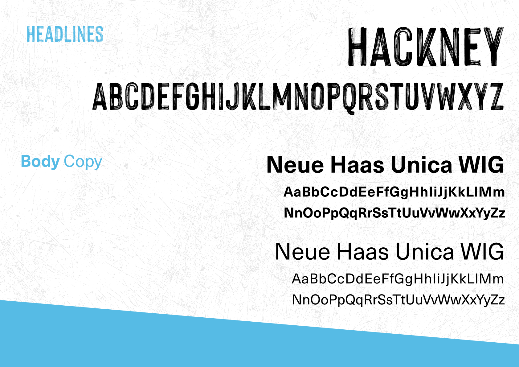
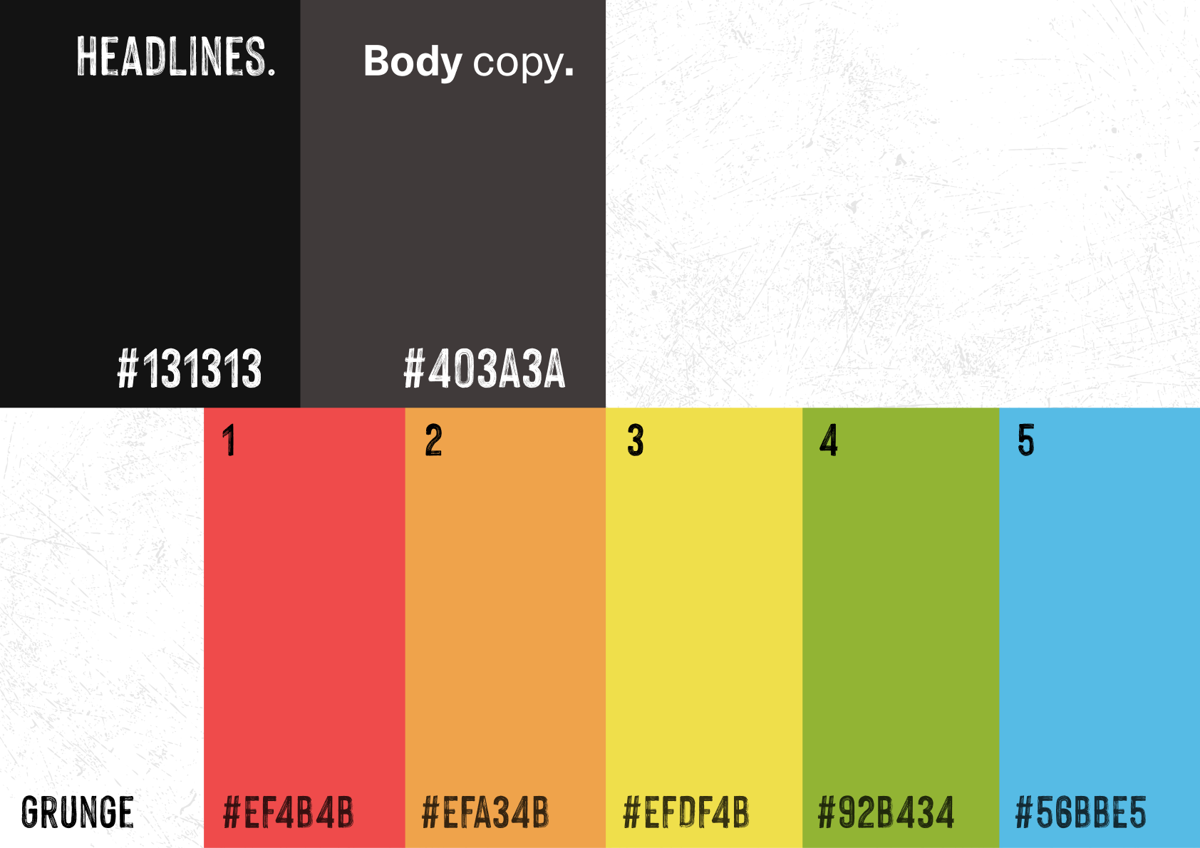
They specifically didn't want anything graffiti-based, so I used angles, distressed textures,
and bright colors to bring out that street art charm.
They specifically didn't want anything graffiti-based, so I used angles, distressed textures,
and bright colors to bring out that street art charm.


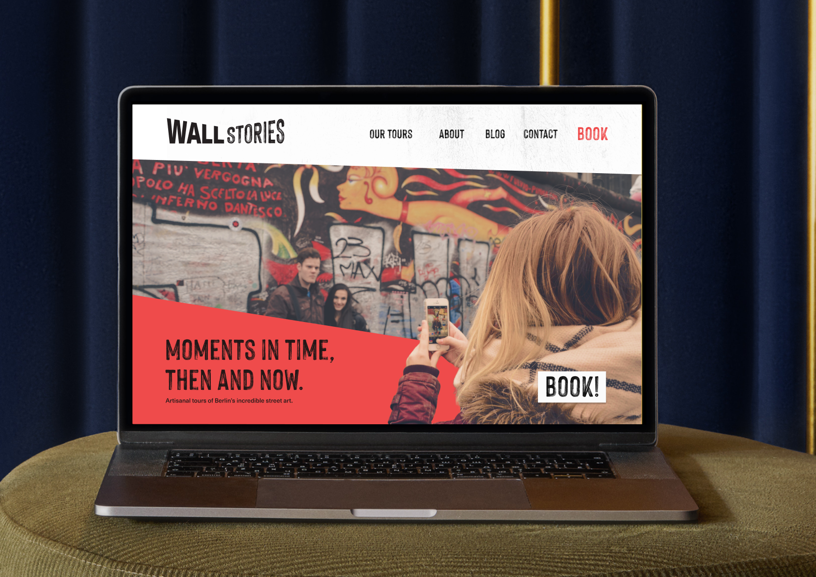
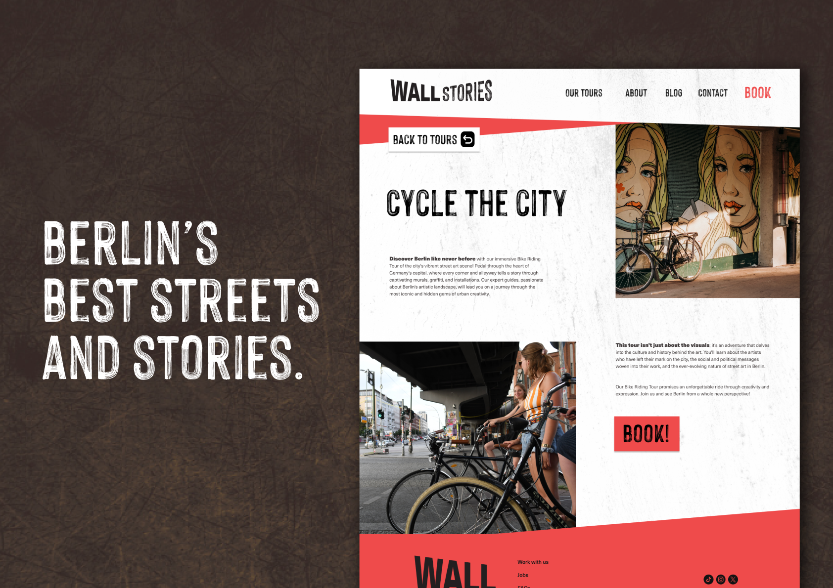
The website's UI is at angles, and different pages and sections are separated by the brand colors.
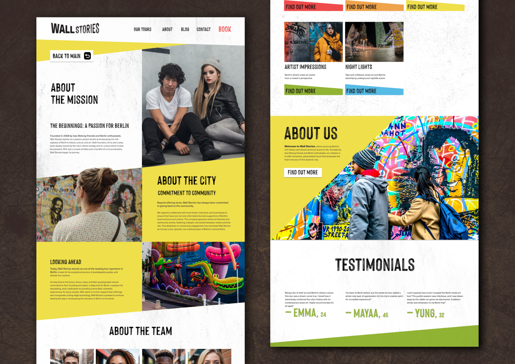
Parts of the images grow out of their frames - the pictures not quite staying within the bounds of where they traditionally should be. But isn't that... just like street art?!