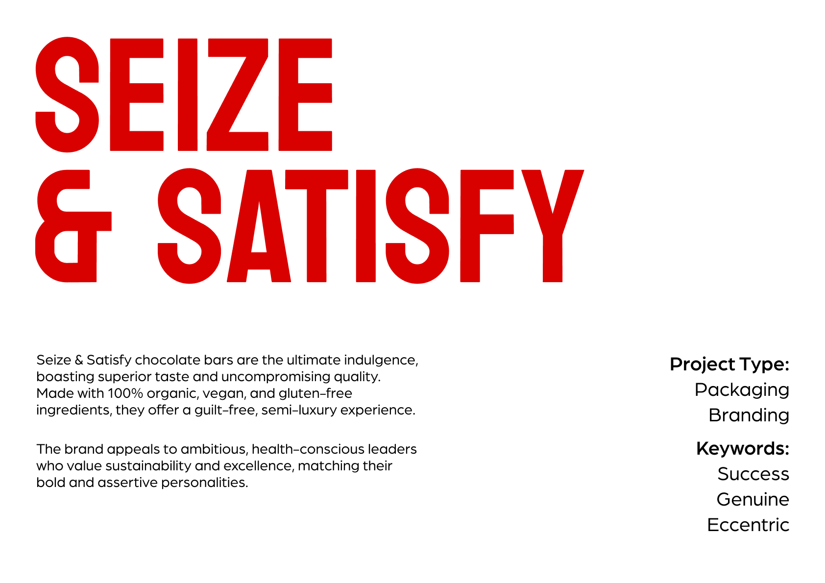
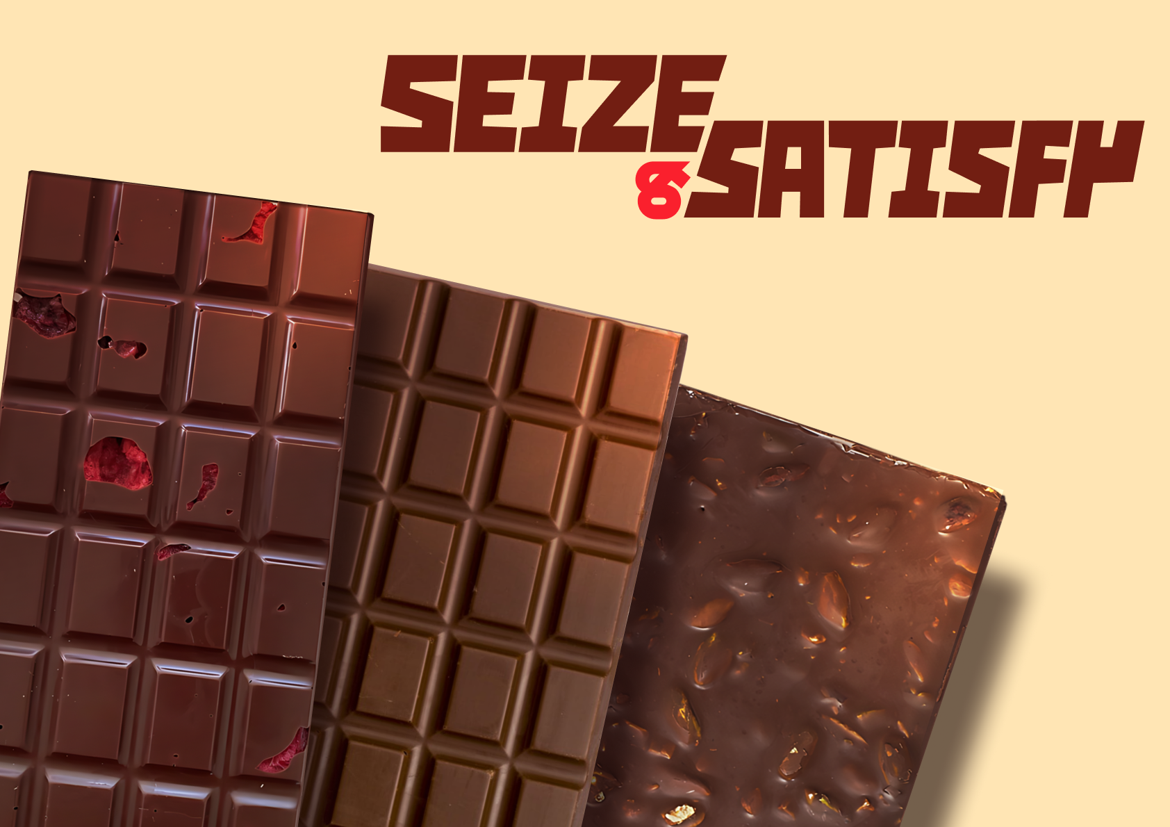
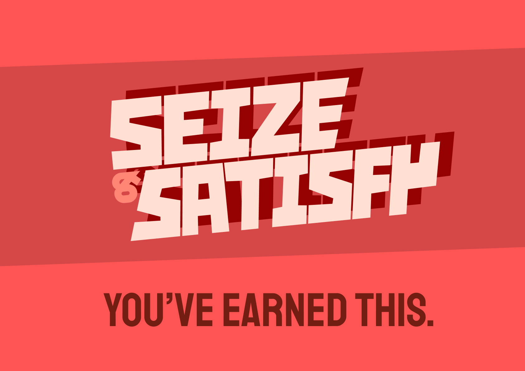
This one's a brand concept, for a confident, tasty, and ethical chocolate bar.
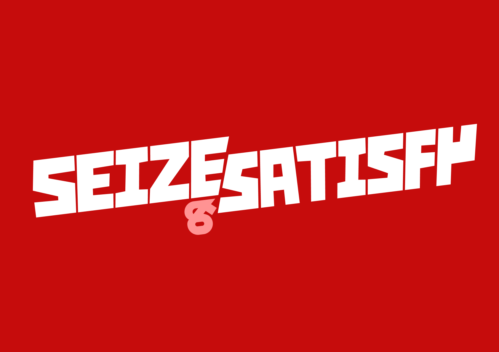
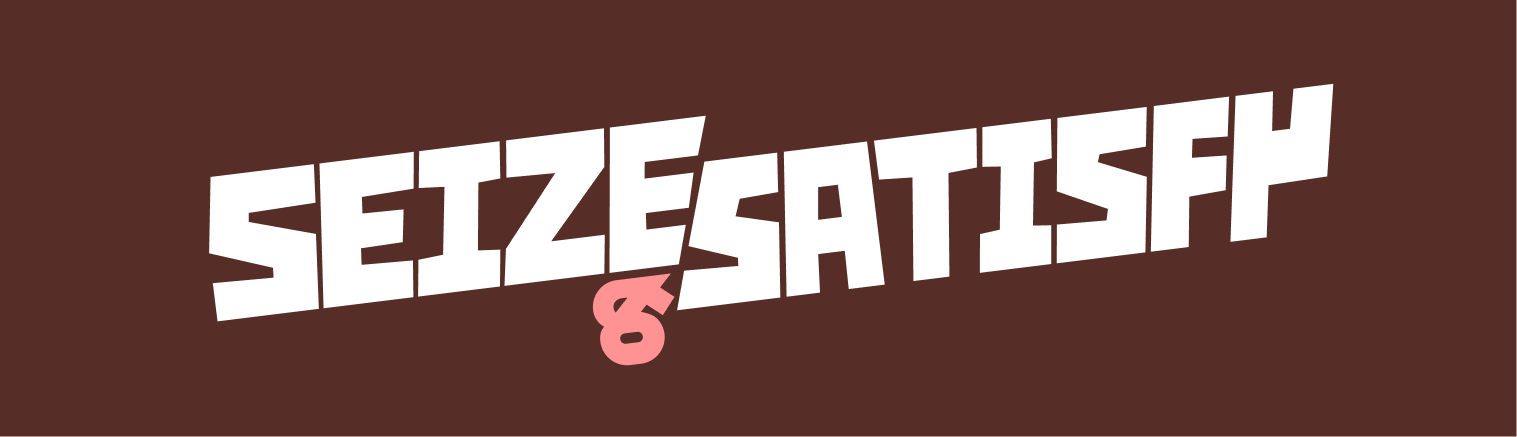
The bespoke type lockup - the text is placed at an odd, soft grid. It's meant to evoke chocolate squares. The sudden split between the words is that "snap" when you break off a piece of that bar.
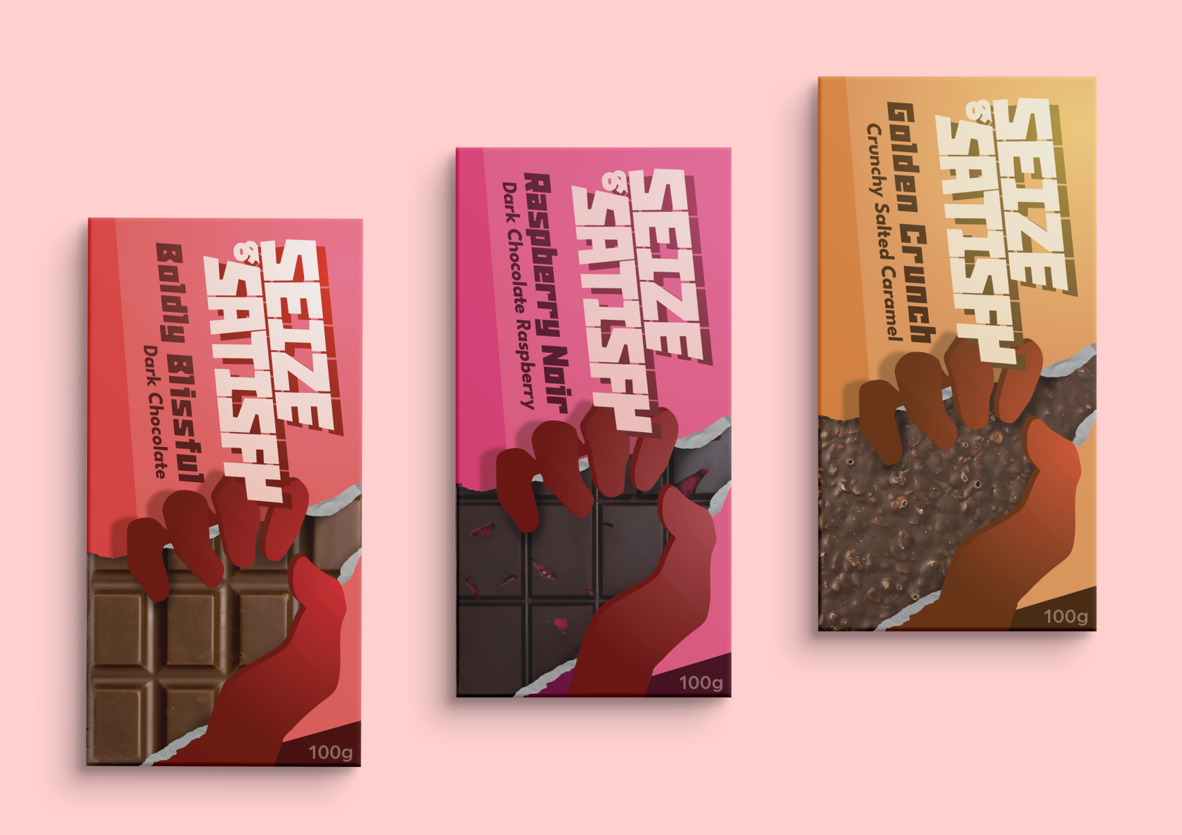
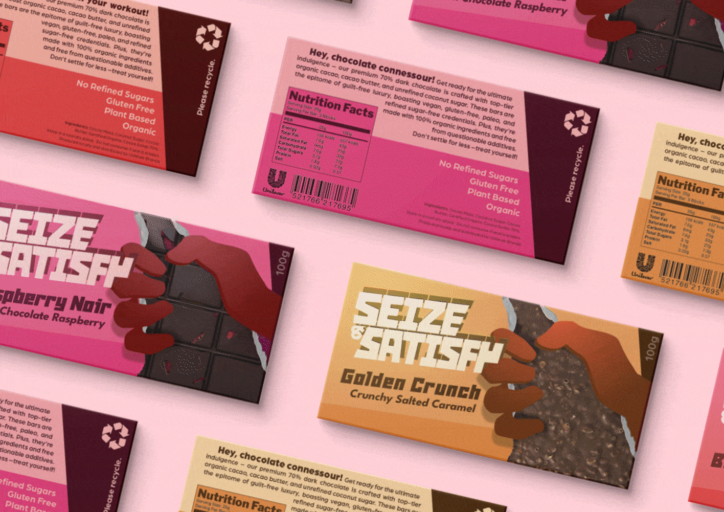
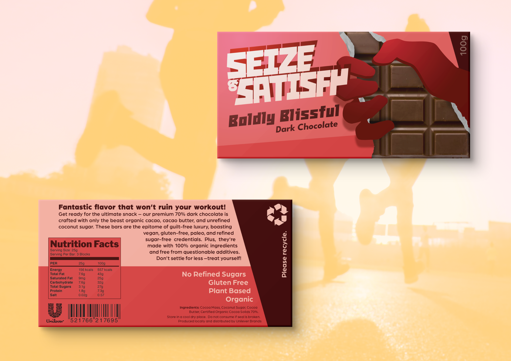
Using illustration skills, the hand breaks the 4th wall a little bit. Somewhat "breaking out of the packaging, it embodies that "seize" attitude this brand is meant to be all about. A considered approach was to use transparent packaging for the part that depicts the chocolate, rather than a pictorial representation.
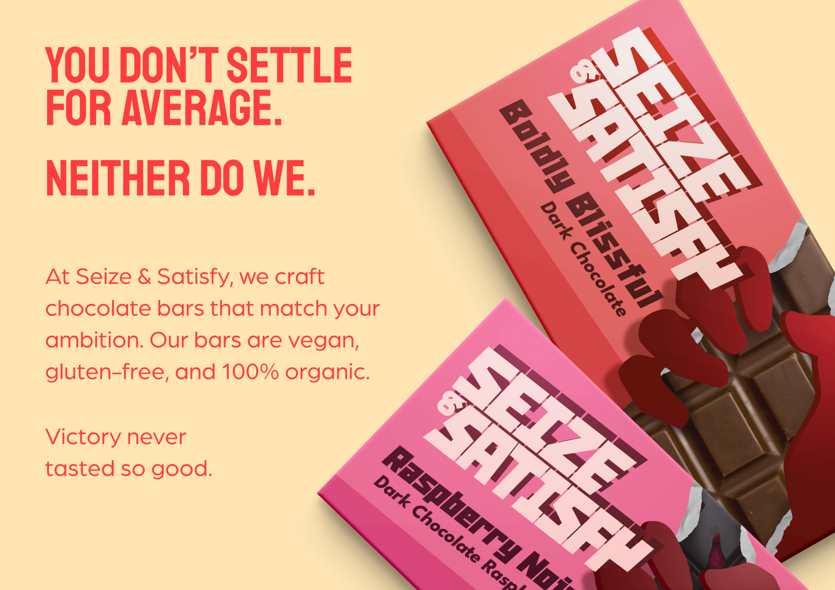
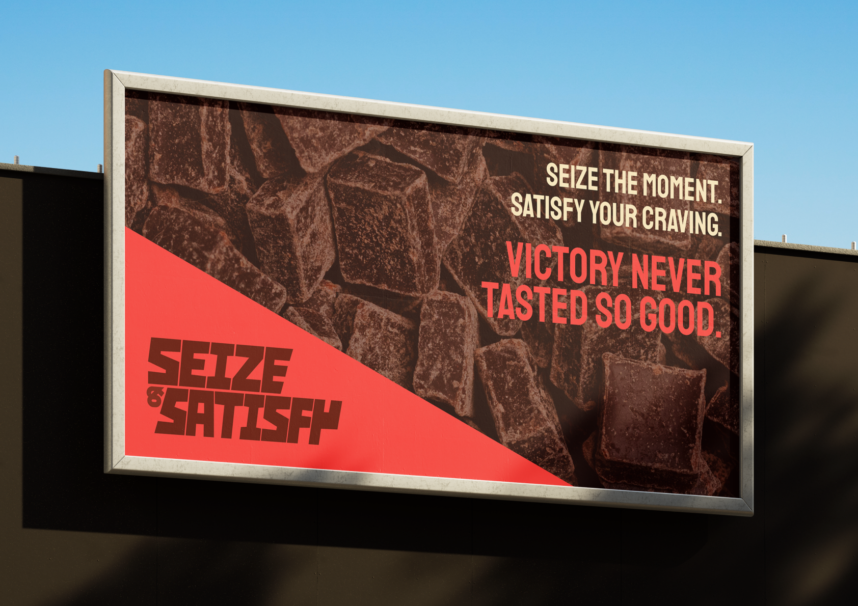
"Victory never tasted so good." - A laconic descriptor for the brand's ethos.
An alternate version of the lockup - meant for less horizontal spaces.